Wednesday, September 30, 2015

The Science of Creating Highly Shareable Infographics [Infographic]

Cool topic? Check. Compelling research? Check. Accurate data? Check, check.

When you're sitting down create an infographic, it's never a good idea to just jump in, translate all that research into bite-sized pieces one after the other, and hope people like it. Infographics don't just randomly become popular -- there's a science to it.

So, what's the secret? Thanks to the folks at Siege Media, we have a much better idea. Using BuzzSumo, they analyzed the 1,000 most-shared infographics in the past year to weed out the common characteristics of the most popular ones.

Their analysis covered color scheme, word count, length (in pixels), and other cool findings -- like the social networks on which infographics about certain topics perform best. They found that infographics on the topic of health performed best on Facebook and Pinterest, while infographics about social media and business performed best on Twitter and LinkedIn.

To learn more about the science of the most popular infographics, check out the infographic below from Siege Media. You can refer to these results to create a data-driven strategy for your own infographics. (For even more inspiration, check out this list of the best infographics of the year.)

10 free infographic templates in powerpoint

The Power of Hustle to Create the Extraordinary with Lisa Messenger

234---The-School-of-Greatness---LisaMessenger

The Power of Hustle to Create the Extraordinary with Lisa Messenger post image

Early this year I was looking for the best digital magazines to get ideas for a magazine I wanted to launch.

I stumbled across a beautifully designed fashion and lifestyle magazine called The Collective and fell in love.

It was not only amazing in design and content, but it was produced digitally and in print – and I could tell it was run by people who knew what they were doing in business.

I had to know who was behind it.

That’s how I discovered today’s guest on  The School of Greatness.

Lisa Messenger is the genius behind The Messenger Group, the media company that produces The Collective Magazine and the events that have followed the brand.

She is a genius of marketing and building community, as you can tell by the rapid rise to success of her magazine that is only 2 years old.

But what I didn’t know until I interviewed her on the show was that she is also a master of hustle.

I honestly felt like I was talking to my sister-in-business as we discussed our viewpoints on what it takes to make it in a crowded industry (starting from nothing).

I loved Lisa’s energy, perspective, and stories and I didn’t want to end the interview.

If you want to know the secrets behind what’s possible when you hustle, listen to Lisa Messenger tell her story in Episode 234.

Subscribe on iTunesStitcher Radio or TuneIn

The School of Greatness Podcast

234---The-School-of-Greatness---LisaMessenger

“From being selfless and doing things with integrity, extraordinary things happen.”

Some questions I ask:

  • How do you get so many celebrities on the cover of The Collective?
  • What are some creative revenue streams you’ve found within the magazine?
  • How did you get your magazine into major stores?
  • Do you feel that the magazine is bigger digitally or in print?

In This Episode, You Will Learn:

  • How Lisa had the guts to enter the dying magazine industry when she had no experience with it
  • Why Lisa says the platform you choose is irrelevant – it’s the message that counts
  • The power of community to help you do something (when you give them a sense of belonging)
  • Lisa’s viewpoint on the value of hustle and how it applies to business and opportunity
  • The beauty of failing fast
  • The importance of finding your purpose and remembering it everyday
  • Plus much more…

Continue Seeking Greatness:

Website | Twitter | Facebook | Instagram

You may also like these episodes:

Did you enjoy the podcast?

I seriously feel like Lisa and I are siblings the way we see the value of hustle. I love what she is creating and her attitude. What do you think is possible after listening to her story?

“I pre-sell everything.”

The post The Power of Hustle to Create the Extraordinary with Lisa Messenger appeared first on Lewis Howes.

Good Social Media Boosts SEO Even Though Nobody Understands How

There is lots of debate over the mechanics of how social media boosts SEO but no doubt that it does.

Tuesday, September 29, 2015

The Best & Worst Subway Map Designs From Around the World

If you were to design a subway map, what would you design for: geographical precision or visual clarity? Is it better for a map to accurately represent the geography at street level, or for it to be abstract and easy-to-understand?

In 1972, Massimo Vignelli chose the latter -- visual clarity -- when he designed a map of the New York City subway system. To Vignelli, the only way to make the crazy twists and turns of the city's subway lines comprehendible to the public would be to, well ... straighten them out.

So he redesigned the map so that all the lines ran either vertically or horizontally. He also made Central Park -- normally a rectangle -- into a square. That's Vignelli's map on the left:

Image Credit: 99designs

The New Yorker called it "a nearly canonical piece of abstract graphic design." But many people focused on the "abstract" part of that description, and it didn't sit will with them. While Vignelli's map was easier for people to navigate, it wasn't an accurate portrayal of the geography. In 1979, it was replaced with a more geographically accurate map -- the one on the right.

Was that the right decision? In 2013, a team of MIT researchers used the Boston subway map to study how the human visual system collects information. They found that "a map need not stay geographically faithful to be visually useful. In certain real-world applications, this understanding might be critical; designing in-car navigation maps that take peripheral vision into account could potentially save lives."

There are dozens of subway systems around the world, illustrated both by maps that are confusing but geographically sound, and maps that are abstract but more soothing to the eye. Let's take a look at some of the world's subway map designs and see how they differ in complexity, abstraction, and style -- and what makes some designs better than others.

The Best Subway Maps in the World
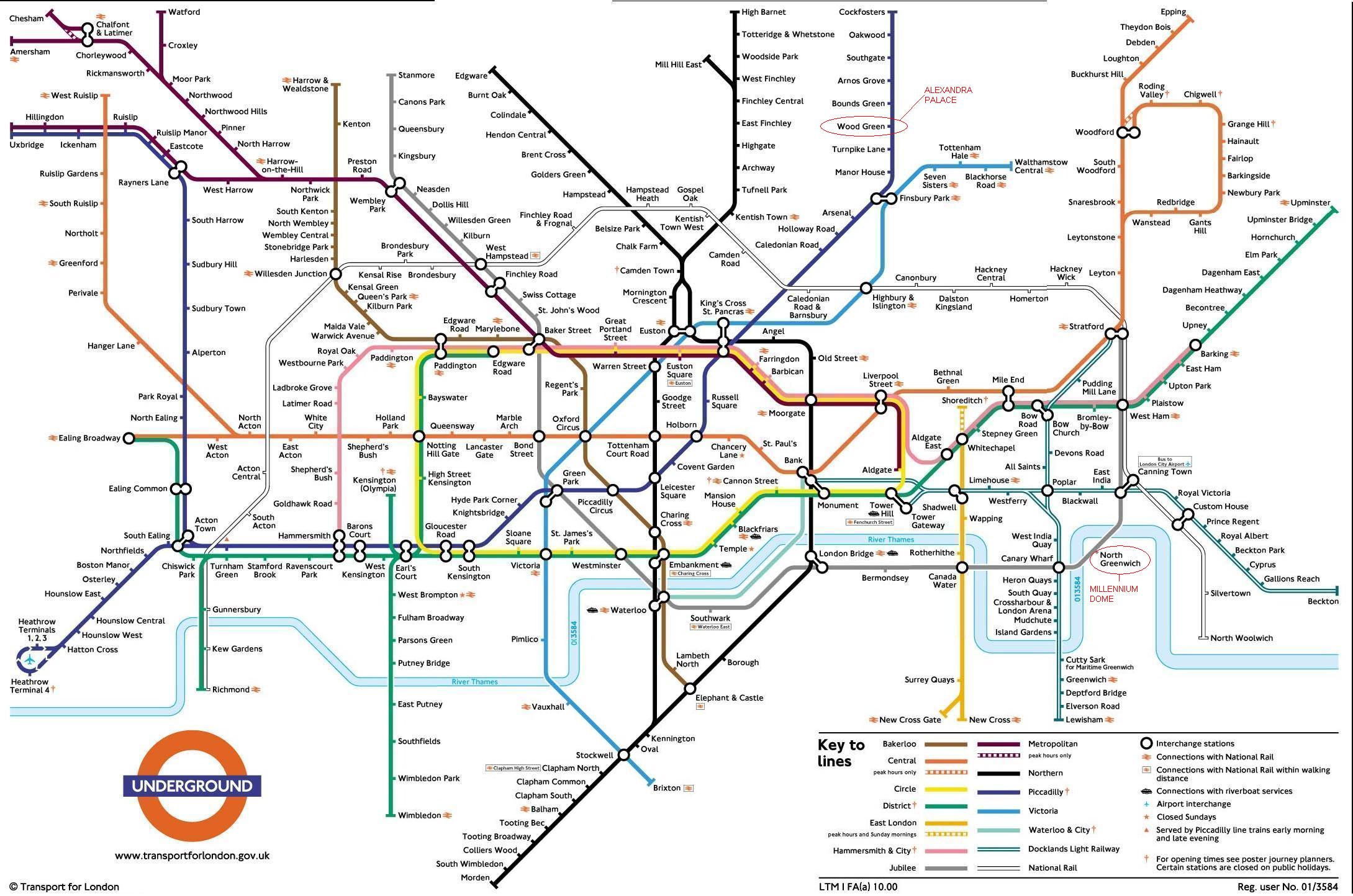
1) London, England

London's subway map is similar to Vignelli's for New York City: It abstracts the city into lines that are only vertical, horizontal, or at 45-degree angles. London's subway system is extremely complex, and while this map may be difficult to read at a small size and employs a complicated color code, it provides a coherent overview.

Image Credit: mapa-metro.com

Compare the subway map above with geographically correct subway routes below:

Image Credit: ArcGIS
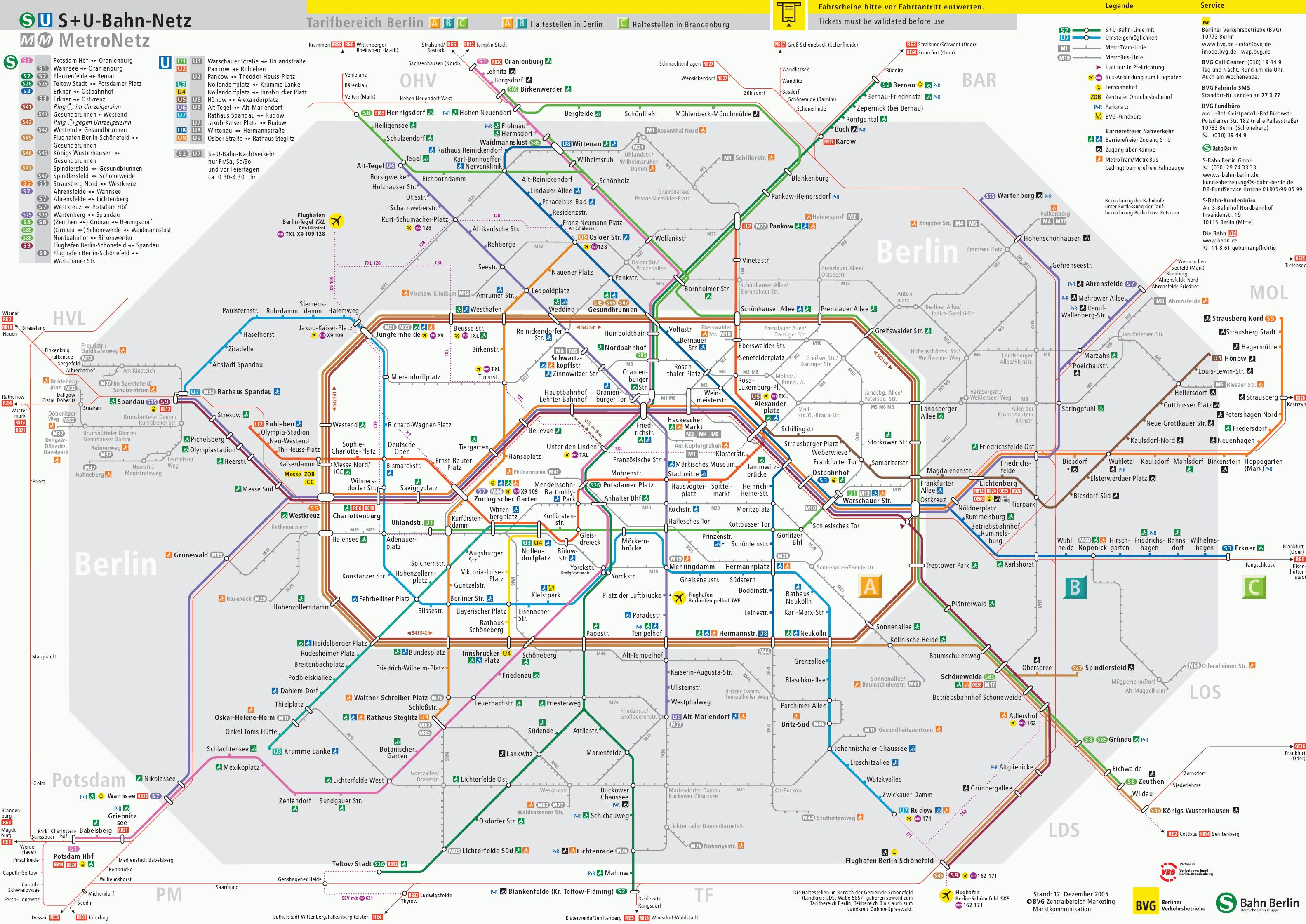
2) Berlin, Germany

Like London, Berlin uses a geographically distorted visualization of its subway system as the main map for travelers. MIT researchers found that subway lines taking sharper turns are easier to follow, and major transfers are crisper as a result.

Image Credit: mapa-metro.com

Compare the layout of Berlin's subway map above with the geographically correct layout below:

Image Credit: 99designs

3) Lisbon, Portugal

Because Lisbon's subway lines are simple and the stops are spread out, the geographically accurate route map actually works fine here. While a more angular map might pass the blink test more readily, this map gives travelers an idea of where exactly in the city they're going.

Image Credit: Lisbon Travel and Holiday Guide

4) Washington, D.C., U.S.A

Washington, D.C.'s subway map uses horizontal, vertical, and 45-degree lines to illustrate its subway map. By including waterways, greenways and parks, and even the most popular monuments right on the subway map -- which are also illustrated in the angular, abstract style -- travelers get more context for each stops' location. This is especially helpful for those who aren't familiar with the city or are visiting some of the most popular locations.

Image Credit: Crazz Images

Compare the above map to a geographically accurate version to get an idea of how the former improves readability:

Image Credit: Charles Buntjer

5) Melbourne, Australia

The map of Melbourne's subway system below is still just a draft, but it's one that The Age reports will likely replace the current map in the next year or two. First, take a look at the draft:

Image Credit: The Age

And compare it to the current map, which will likely disappear soon:

Image Credit: The Age

The subway map upgrade isn't a drastic change in style. As you can see, both the draft of the new map and the current map both employ the geographically distorted style of Vignelli's NYC map. Instead, the biggest change is in the coloring. While the old map uses only blue and yellow, the draft uses 10 different colors and several patterns to give a better indication of where trains move throughout the city.

6) Moscow, Russia

Moscow's subway map has gone through many iterations since its inception in 1935, becoming more and more abstract as time goes on. The result is what you see below: brightly colored, angular lines set around a circle that immediately catches your eye. It's also great how well the major transfer hubs pop: outlined groupings where two, three, or four lines meet.

Image Credit: Moscow Metro Official Site

The Worst Subway Maps in the World

7) Stuttgart, Germany

While the straight and crisp lines in Stuttgart's subway map make individual stops and transfers easier to navigate, the perspective isn't very easy on the eyes. A bird's eye view of the map would make for an easier-to-understand design.

Image Credit: Planetolog.com

8) Mexico City, Mexico

Thankfully, there are other versions of Mexico City's subway map than the one below -- but this one is still used by the city as one of the official maps. It's chaotic if nothing else -- especially with the road map overlay.

Image Credit: Geo-Mexico

9) Tokyo, Japan

Tokyo's subway system is one of the most complex in the world, so it's no surprise its map is nearly frightening to look at. With so many symbols and colors, it's hard to make sense of where you need to go.

Image Credit: Tokyo Metro

Several designers have taken on the challenge of trying to redesign Tokyo's subway map to make it more comprehendible. Here's one iteration:

Image Credit: The Guardian

What do you think of these subway maps? Which styles do you find easiest to understand? Share your thoughts with us in the comments.

free visual content crash course

How to Find the Right Tone and Style to Resonate With Your Readers

If you really want to create content that delivers your message in a way that strikes the right chord within your audience, it's important to mold and shape it.

The 7 Excel Tricks Every Office Worker Should Know [Infographic]

Computer technology moves fast -- which is why it's so hard to believe that a computer program that's been around for 30 years is still one of the most popular programs in the world. And yet, I'm willing to bet every single one of you has had to use Microsoft Excel at some point in your life.

Nowadays, most office workers are simply expected to know basic Excel functions -- so much so that many recruiters suggest you shouldn't even bother listing it on your resume. "I swap 'Proficient in Word, Excel and PowerPoint' for 'Proficient in Breathing Oxygen,'" quipped the founder of Mergers & Inquisitions.

Beyond creating basic charts and graphs, there are a few other Excel tricks that everyone working in an office should know. For instance, it's really helpful to at least have a basic understanding of how to create pivot tables and VLOOKUPs. (Don't worry -- it's easier than it sounds.)

From charting to conditional formatting to pivot tables, check out the infographic below from Microsoft Training to learn the top seven most useful Excel tricks everyone working in an office environment should be familiar with. (And read this blog post to learn these tricks and others in more detail.)

What other Excel tricks do you find handy? Share with us in the comments.

free excel templates for marketing